Revisiting an old piece of work I reflect on the processes that led to it: intuition and formalism, incubation and insight, publish or perish, and a malaise at the heart of current computer science.
A couple of weeks ago I received an email requesting an old technical report, “Finding fixed points in non-trivial domains: proofs of pending analysis and related algorithms” [Dx88]. This report was from nearly 30 years ago, when I was at York and before the time when everything was digital and online. This was one of my all time favourite pieces of work, and one of the few times I’ve done ‘real maths’ in computer science.
As well as tackling a real problem, it required new theoretical concepts and methods of proof that were generally applicable. In addition it arose through an interesting story that exposes many of the changes in academia.
[Aside, for those of more formal bent.] This involved proving the correctness of an algorithm ‘Pending Analysis’ for efficiently finding fixed points over finite lattices, which had been developed for use when optimising functional programs. Doing this led me to perform proofs where some of the intermediate functions were not monotonic, and to develop forms of partial order that enabled reasoning over these. Of particular importance was the concept of a pseudo-monotonic functional, one that preserved an ordering between functions even if one of them is not itself monotonic. This then led to the ability to perform sandwich proofs, where a potentially non-monotonic function of interest is bracketed between two monotonic functions, which eventually converge to the same function sandwiching the function of interest between them as they go.
Oddly while it was one my favourite pieces of work, it was at the periphery of my main areas of work, so had never been published apart from as a York technical report. Also, this was in the days before research assessment, before publish-or-perish fever had ravaged academia, and when many of the most important pieces of work were ‘only’ in technical report series. Indeed, our Department library had complete sets of many of the major technical report series such as Xerox Parc, Bell Labs, and Digital Equipment Corporation Labs where so much work in programming languages was happening at the time.
 My main area was, as it is now, human–computer interaction, and at the time principally the formal modelling of interaction. This was the topic of my PhD Thesis and of my first book “Formal Methods for Interactive Systems” [Dx91] (an edited version of the thesis). Although I do less of this more formal work now-a-days, I’ve just been editing a book with Benjamin Weyers, Judy Bowen and Philippe Pallanque, “The Handbook of Formal Methods in Human-Computer Interaction” [WB17], which captures the current state of the art in the topic.
Moving from mathematics into computer science, the majority of formal work was far more broad, but far less deep than I had been used to. The main issues were definitional: finding ways to describe complex phenomena that both gave insight and enabled a level of formal tractability. This is not to say that there were no deep results: I recall the excitement of reading Sannella’s PhD Thesis [Sa82] on the application of category theory to formal specifications, or Luca Cardelli‘s work on complex type systems needed for more generic coding and understanding object oriented programing.
The reason for the difference in the kinds of mathematics was that computational formalism was addressing real problems, not simply puzzles interesting for themselves. Often these real world issues do not admit the kinds of neat solution that arise when you choose your own problem — the formal equivalent of Rittel’s wicked problems!
Crucially, where there were deep results and complex proofs these were also typically addressed at real issues. By this I do not mean the immediate industry needs of the day (although much of the most important theoretical work was at industrial labs); indeed functional programming, which has now found critical applications in big-data cloud computation and even JavaScript web programming, was at the time a fairly obscure field. However, there was a sense in which these things connected to a wider sphere of understanding in computing and that they could eventually have some connection to real coding and computer systems.
This was one of the things that I often found depressing during the REF2014 reading exercise in 2013. Over a thousand papers covering vast swathes of UK computer science, and so much that seemed to be in tiny sub-niches of sub-niches, obscure variants of inconsequential algebras, or reworking and tweaking of algorithms that appeared to be of no interest to anyone outside two or three other people in the field (I checked who was citing every output I read).
(Note the lists of outputs are all in the public domain, and links to where to find them can be found at my own REF micro-site.)
If this had been pure mathematics papers it is what I would have expected; after all mathematics is not funded in the way computer science is, so I would not expect to see the same kinds of connection to real world issues. Also I would have been disappointed if I had not seen some obscure work of this kind; you sometimes need to chase down rabbit holes to find Aladdin’s cave. It was the shear volume of this kind of work that shocked me.
Maybe in those early days, I self-selected work that was both practically and theoretically interesting, so I have a golden view of the past; maybe it was simply easier to do both before the low-hanging fruit had been gathered; or maybe just there has been a change in the social nature of the discipline. After all, most early mathematicians happily mixed pure and applied mathematics, with the areas only diverging seriously in the 20th century. However, as noted, mathematics is not funded so heavily as computer science, so it does seem to suggest a malaise, or at least loss of direction for computing as a discipline.
Anyway, roll back to the mid 1980s. A colleague of mine, David Wakeling, had been on a visit to a workshop in the States and heard there about Pending Analysis and Young and Hudak’s proof of its correctness . He wanted to use the algorithm in his own work, but there was something about the proof that he was unhappy about. It was not that he had spotted a flaw (indeed there was one, but obscure), but just that the presentation of it had left him uneasy. David was a practical computer scientist, not a mathematician, working on compilation and optimisation of lazy functional programming languages. However, he had some sixth sense that told him something was wrong.
Looking back, this intuition about formalism fascinates me. Again there may be self-selection going on, if David had had worries and they were unfounded, I would not be writing this. However, I think that there was something more than this. Hardy and Wright, the bible of number theory , listed a number of open problems in number theory (many now solved), but crucially for many gave an estimate on how likely it was that they were true or might eventually have a counter example. By definition, these were non-trivial hypotheses, and either true or not true, but Hardy and Wright felt able to offer an opinion.
For David I think it was more about the human interaction, the way the presenters did not convey confidence. Maybe this was because they were aware there was a gap in the proof, but thought it did not matter, a minor irrelevant detail, or maybe the same slight lack of precision that let the flaw through was also evident in their demeanour.
In principle academia, certainly in mathematics and science, is about the work itself, but we can rarely check each statement, argument or line of proof so often it is the nature of the people that gives us confidence.
Quite quickly I found two flaws.
One was internal to the mathematics (math alert!) essentially forgetting that a ‘monotonic’ higher order function is usually only monotonic when the functions it is applied to are monotonic.
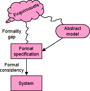 The other was external — the formulation of the theorem to be proved did not actually match the real-world computational problem. This is an issue that I used to refer to as the formality gap. Once you are in formal world of mathematics you can analyse, prove, and even automatically check some things. However, there is first something more complex needed to adequately and faithfully reflect the real world phenomenon you are trying to model.
I’m doing a statistics course at the CHI conference in May, and one of the reasons statistics is hard is that it also needs one foot on the world of maths, but one foot on the solid ground of the real world.
Finding the problem was relatively easy … solving it altogether harder! There followed a period when it was my pet side project: reams of paper with scribbles, thinking I’d solved it then finding more problems, proving special cases, or variants of the algorithm, generalising beyond the simple binary domains of the original algorithm. In the end I put it all into a technical report, but never had the full proof of the most general case.
Then, literally a week after the report was published, I had a notion, and found an elegant and reasonably short proof of the most general case, and in so doing also created a new technique, the sandwich proof.
Reflecting back, was this merely one of those things, or a form of incubation? I used to work with psychologists Tom Ormerod and Linden Ball at Lancaster including as part of the Desire EU network on creativity. One of the topics they studied was incubation, which is one of the four standard ‘stages’ in the theory of creativity. Some put this down to sub-conscious psychological processes, but it may be as much to do with getting out of patterns of thought and hence seeing a problem in a new light.
In this case, was it the fact that the problem had been ‘put to bed’, enabled fresh insight?
Anyway, now, 30 years on, I’ve made the report available electronically … after reanimating Troff on my Mac … but that is another story.
References
[Dx91] A. J. Dix (1991). Formal Methods for Interactive Systems. Academic Press.ISBN 0-12-218315-0 http://www.hiraeth.com/books/formal/
[Dx88] A. J. Dix (1988). Finding fixed points in non-trivial domains: proofs of pending analysis and related algorithms. YCS 107, Dept. of Computer Science, University of York. https://alandix.com/academic/papers/fixpts-YCS107-88/
[HW59] G.H. Hardy, E.M. Wright (1959). An Introduction to the Theory of Numbers – 4th Ed. Oxford University Press. https://archive.org/details/AnIntroductionToTheTheoryOfNumbers-4thEd-G.h.HardyE.m.Wright
[Sa82] Don Sannella (1982). Semantics, Imlementation and Pragmatics of Clear, a Program Specification Language. PhD, University of Edinburgh. https://www.era.lib.ed.ac.uk/handle/1842/6633
[WB17] Weyers, B., Bowen, J., Dix, A., Palanque, P. (Eds.) (2017) The Handbook of Formal Methods in Human-Computer Interaction. Springer. ISBN 978-3-319-51838-1 http://www.springer.com/gb/book/9783319518374
[YH96] J. Young and P. Hudak (1986). Finding fixpoints on function spaces. YALEU/DCS/RR-505, Yale University, Department of Computer Science http://www.cs.yale.edu/publications/techreports/tr505.pdf


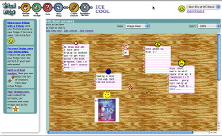
 The core idea of vfridge is placing small notes, photos and ‘magnets’ in a shareable web area that can be moved around and arranged like you might with notes held by magnets to a fridge door.
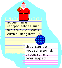 Just over a year ago I thought it would be good to write a retrospective about vfridge in the light of the social networking revolution. We did a poster “


 In odd moments I have recently been working on bringing