Abstract
This is a short introduction to information visualisation, which is essentially about making data easier to understand using direct sensory experience, as opposed to more linguistic/logical reasoning.
Note that while the term suggests the visual sense, and indeed this is the most common, in fact there are also aural and tactile ‘visualisations', for use by those with disabilities or in situations where visual displays would not be appropriate. Visualisations may be designed for end users / information consumers for whom the visualisation will normally have to be very easy to understand, or for more professional data analysts, who may be able to use more complex visualisations including explicit training. Most challenging is exploratory visualisation as, by definituion, you do not know before hand what you want to be absle to see in the data.
 Static visualisation can be traced back at least 2500 years, including linegraphs from the 10th Century, but it was in the early 1990s that computer-based interactive visualisations became possible. Currently, visualisation needs to address data sets of rapidly growing sizes, but also is often presented over the web, both creating new challenges. Furthermore, the increasing complexity of data processing, including machine learning, that is part of visualisation has led to the new arae of visual analytics.
It is easy to focus on the single user interacting witgh a visual represention (visualisation) or with it and the data processing leaidng to it (visual analytics). However, both take place in a broader context where the data being visualised comes from the world, the visualisation helps indioviduals or organisations to make decsions, and these decisions lead to actions which change the world and thus the data being visualised.
Designing visualisations requires an understaidng of the human visual (or other sense) system, the obhjective/goals that the visualisation is to aid, and aesthetics (especially for persuasive graphics). Choosing an appropriate represnetaton typically requires choices and trade-offs between factors, but interactive visualisation can soften these trade-offs, allowing choices to be remade by the user as they interact with the system.
References and Links
Books on information visualisation
Information visualization: design for interaction
Bob Spence, Prentice Hall, 2007 (2nd ed).
see at Amazon | Google Books | Publisher
Readings in Information Visualization
Stuart Card, Jock Mackinlay, and Ben Shneiderman, Morgan Kaufmann, 1999.
see at Amazon | Google Books | authors' site
Pretty much all the classic papers in the area.
Mastering the Information Age
http://www.vismaster.eu/news/mastering-the-information-age/
This is the European roadmap for visual analytics, produced as an outcome of the EU VisMaster Coordinated Action. The 'visualisation in context' section of the talk is based on Chapter 7 "Perception and Cognitive Aspects".
Illuminating the Path
http://nvac.pnl.gov/agenda.stm
No, not eastern religion, but the earlier US Visual Analytics R&D agenda funded by the US Dept. of Homeland Security.
The Visual Display of Quantitative Information
Edward R. Tufte, Graphics Press, Cheshire, CO, USA, 1983
Tufte's books are the classics in static visualisation.
see at Aspire | Amazon | Google Books | authors' site
Envisioning Information
Edward R. Tufte, Graphics Press, Cheshire, CO, USA, 1990
see at Aspire | Amazon | Google Books | authors' site
Visual Explanations
Edward R. Tufte, Cheshire, CT, Graphics Press, USA, 1997.
see at Aspire | Amazon | Google Books | authors' site
Some web sites collecting visualisations
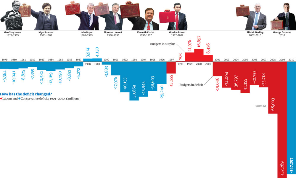
Guardian Data: Deficit Debt Government Borrowing Data
http://www.guardian.co.uk/news/datablog/2010/oct/18/
deficit-debt-government-borrowing-data
Guardian Data is brill! They don't just show the infopgraphics, but also provide spreadsheets of the underlying data so you can do your own analysis (e.g. In this case, show the deficit corrected for changing GDP / inflation).
IBM Many Eyes
http://www-958.ibm.com/software/data/cognos/manyeyes/
Site allowing end-users to create visualisations of user-contributed data sets.

Infosethics
http://infosthetics.com/
Information is Beautiful
http://www.informationisbeautiful.net/
Visual Complexity
http://www.visualcomplexity.com/vc/
Specific systems and papers
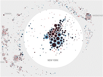
Map Your Move
http://moritz.stefaner.eu/projects/map your moves/
The visualisation I discussed at the beginning. Data on where New Yorkers move to/from.
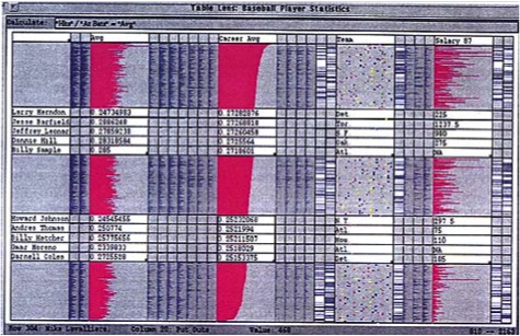
TableLens
R. Rao, S. Card. The Table Lens: Merging graphical and symbolic representations in an interactive focus + context visualization for tabular information, Proc. CHI'94, Boston, ACM Press, 1994, pp.111-117
Interactive stacked histogram.
http://www.meandeviation.com/dancing-histograms/
Adding simple interaction to a common visualisation relaxes the trade-offs in choice of representation.

Film Finder
http://www.sapdesignguild.org/community/book_people/
visualization/controls/FilmFinder.htm
Early example of the usre of dynamic sliders and Shneiderman's visualisation mantra "overview first, zoom and filter, then details on demand".
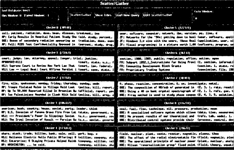
Scatter/Gather Browser
P. Pirolli, P. Schank, M. Hearst, C. Diehl. Scatter/ Gather browsing communicates the topic structure of a very large text collection, Proc. CHI'96, Vancouver, May 1996, ACM Press, pp.213-220.
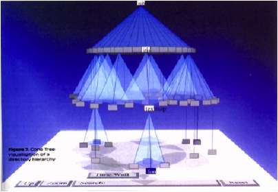
ConeTrees
Robertson, G. G. ; Mackinlay, J. D. ; Card, S. K. Cone Trees: animated 3D visualizations of hierarchical information. Proceedings of the ACM Conference on Human Factors in Computing Systems (CHI '91); 1991 April 27 - May 2; New Orleans; LA. NY: ACM; 1991; 189-194.

Treemap
http://www.cs.umd.edu/hcil/treemap/
2D space filling visualisation for hierarchical data.

Hyperbolic Browser
Lamping, J., Rao R. (1996). Visualizing Large Trees Using the Hyperbolic Browser. Proc. ACM CHI '96 Conference.
Lamping, J., Rao R. & Pirolli, P. (1995). A focus+context technique based on hyperbolic geometry for visualizing large hierarchies. Proc. ACM CHI '95 Conference, 401-408.
HiBrowse
Pollitt, A. S., Ellis, G. P., and Smith, M. P. 1994. HIBROWSE for bibliographic database. J. Inf. Sci. 20, 6 (Nov. 1994), 413-426.
Ellis, G. and Finlay, J. and Pollitt, A.S. (1994) HIBROWSE for Hotels: bridging the gap between user and system views of a database. In: IDS'94 Workshop on User Interfaces to Databases.
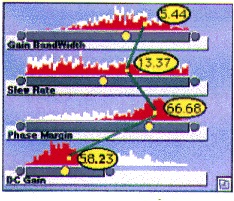
Influence Explorer
Tweedie, L., Spence, R., Dawkes, H., & Su, H. (1996). The Influence Explorer. ACM, Proceedings of CHI '95
Tweedie, L., Spence, R., Dawkes, H., & Su, H. (1996). The Influence Explorer (video) – a tool for design. ACM, CHI '96.
See also movie of Inluence Explorer on Bob Spence's web site.
Information Scent
Pirolli, P., Card, S. K. and Van Der Wege, M. (2000).
The Effect of Information Scent on Searching Information Visualizations of Large Tree Structures.
AVI 2000, Palermo, Italy.
|